PolicyStat (name of the company and their product) is a policy-management application used mainly by hospitals across North America to organize and manage hospital policies and documents. It keeps hospital staff up-to-date with the latest policies and also prevents legal issues by preparing hospitals for audits.
Redesigning an entire product
PolicyStat needed to completely overhaul their legacy application.
The existing product had many usability issues, lacked consistent branding, and was not responsive for mobile devices.
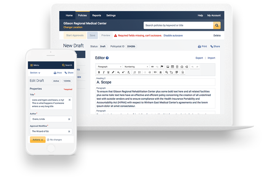
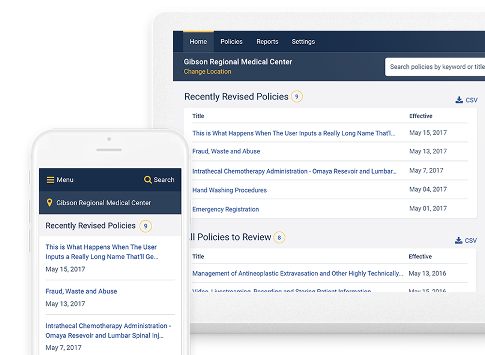
 Before and after of the landing page on mobile. We redesigned the every screen to be responsive.
The task was to:
- Make the app responsive so it can be used on the go.
- Establish a brand and update the look and feel, something that currently did not exist.
- Make the complex application user friendly and meet accessibility standards.
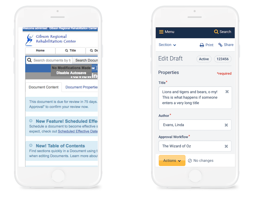 Before and after of text editing on mobile.
The reason this redesign was critical was because:
The home health market is growing. This means that soon, more healthcare providers will need access to policies while they are on the go and treating patients in their own homes. (GlobeNewswire, 2018)
52% of internet traffic is from mobile devices, so making our app mobile-friendly would meet customers where they are. (Hosting Facts, 2017)
Apps with poor UX and outdated interfaces are less likely to be trusted over apps with better ones. This redesign would give customers another reason to choose us over our competitors. (Forbes, 2017)
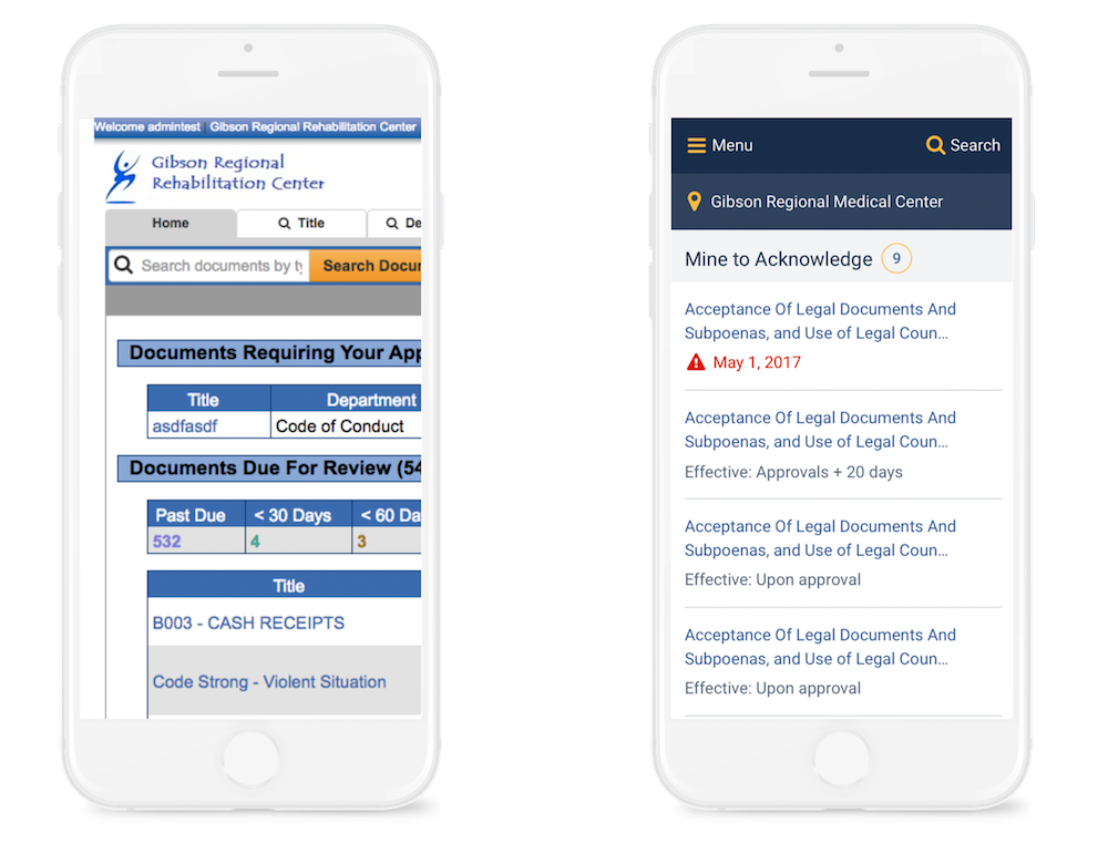
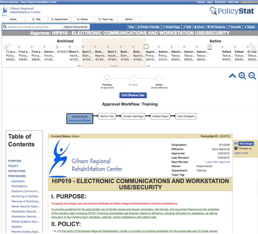
 Before: The text editor was cluttered with notifications.
 After: Notifications are strategically placed next to new features.
Establishing a consistent style
Because the app is data-heavy and driven by user input, our style guide needed to contain dozens of variations of form fields, text inputs, radio buttons, dropdowns, buttons, filters, and more. For each type of input, we also designed its error states.
 The original app had no visual consistency. There were dozens of button styles, error states, form styles, and more.
We created three versions of the style guide and asked others to vote on which one they felt best represented PolicyStat.
 An early iteration of the style guide.
The challenges
One of the greatest challenges was redesigning the data tables in the app. PolicyStat relied heavily on large data tables with dozens of rows, columns, search filters, and pagination.
How can we make giant, complex data tables responsive?
I worked on the PolicyStat redesign for eight months doing user research, creating mockups in Sketch for mobile and desktop screen sizes, and conducting user testing interviews with real customers.
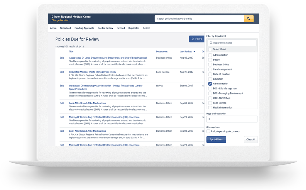 Filtering large data tables on desktop.
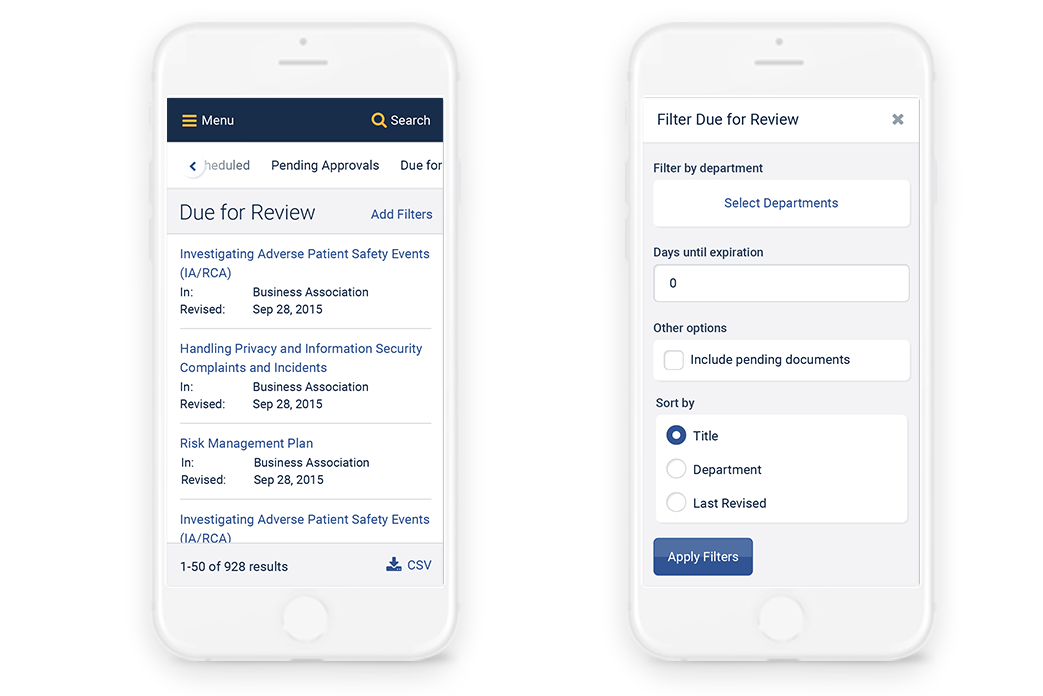 How complex tables and filters would appear on a small screen.
Designing for accessibility
The design team at PolicyStat strongly advocates for meeting web accessibility standards and believes that the product should be usable by everyone. As such, for each screen we designed we double checked things such as color contrast, font sizes, and buttons with easy-to-click clickable areas.
Stress testing everything
Since all the content within the app is defined by the user, we needed to make sure our designs could handle every single type of text, of any length, long or short.
 We decided to truncate extremely long policy names.
User testing every step of the way
With all the major changes we were making to the visual style, navigation, information architecture, and user experience, it was critical that we user tested everything. We gained many insights through regular user testing (for a few months, we user tested our designs on almost six different customers a week).
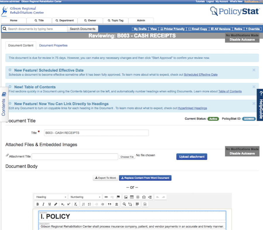
 Before: Reading a policy was a messy experience.
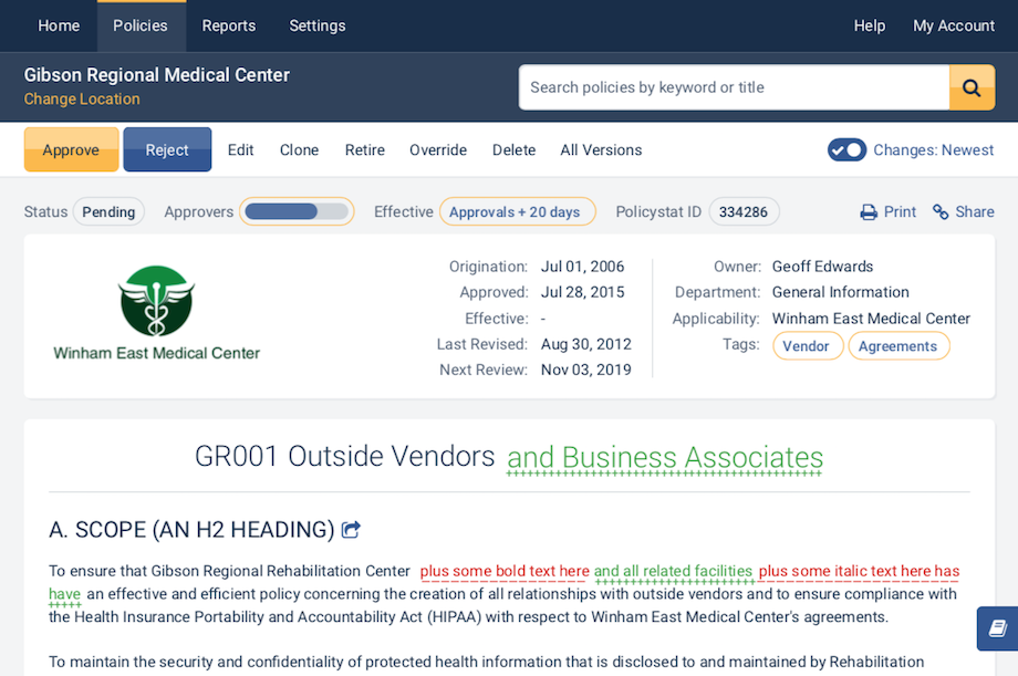 After: A cleaner design.